

From Reminder Tool to Behavioral Support: UX Research & Design with Agentic AI for a Medication Adherence Mobile App
Project Summary: Led end-to-end UX research, iterative design, and validation for a behavior-first medication adherence mobile app called BetterMed. Designed core adherence flows and later extended the MVP with an agentic AI layer to support long-term behavioral consistency and emotional safety.
Responsibilities: UX Researcher, Behavioral Insight Synthesis, AI-Assisted Prototyping, Interaction Designer / UX Designer, Usability Testing & Iterative Refinement, Agentic AI Design.
Key Outcome: Validated core adherence flows with 100% task completion, eliminated structural friction from Round 1, and introduced an agentic AI layer that delivers personalized, context-aware support to sustain long-term adherence.
PROBLEM STATEMENTHow might we move beyond reminder-based solutions to support lasting medication adherence through behavior change, adaptive support, reduced cognitive load, and increased user trust? (Explored through an Agentic AI-assisted MVP for rapid concept validation)
SNEAK PEAK: BEFORE AND AFTERBefore: Tasks were completable, but the experience lacked the ease users needed.
Clunky information architecture and hidden medication states created confusion and disrupted continuity.
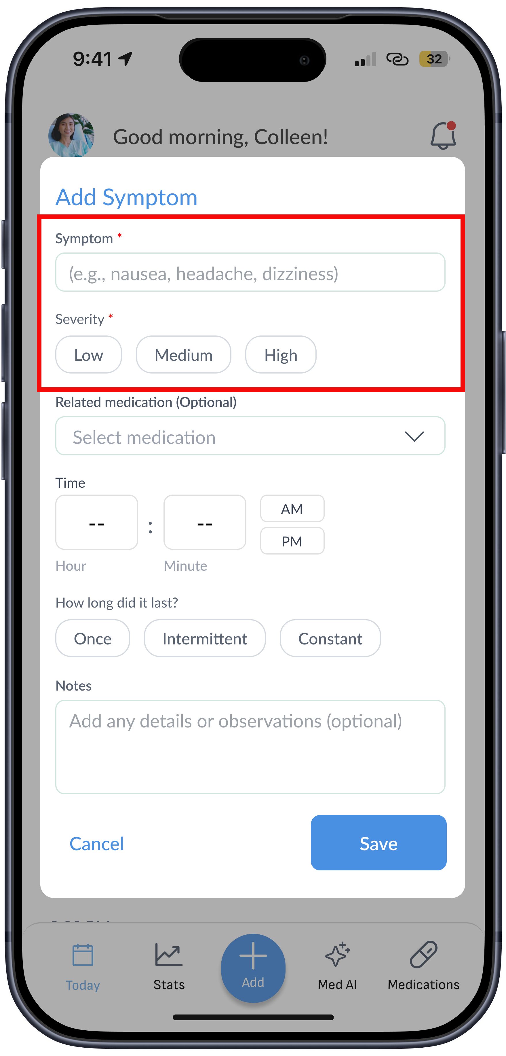
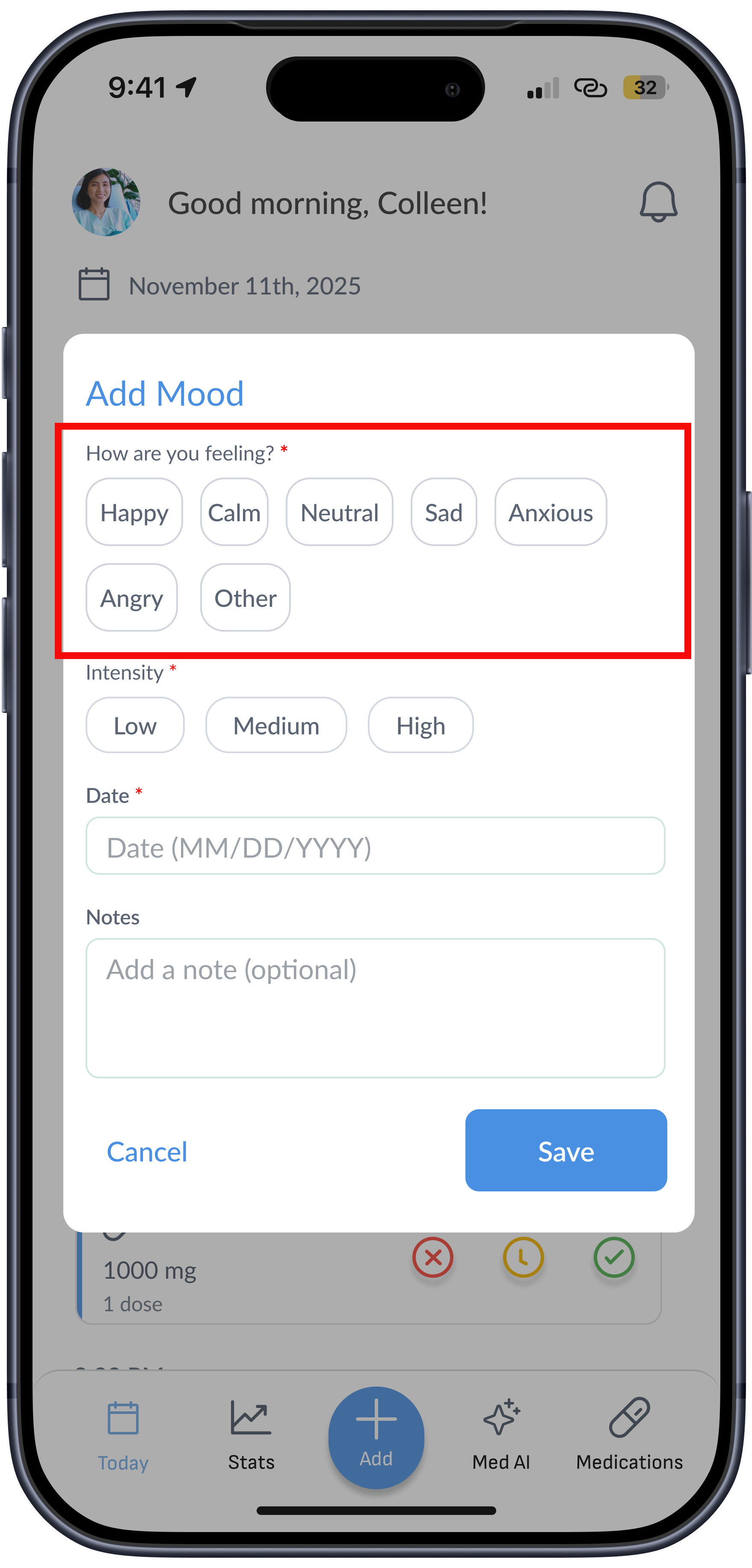
Generic symptom logging felt impersonal and lacked relevance for users.
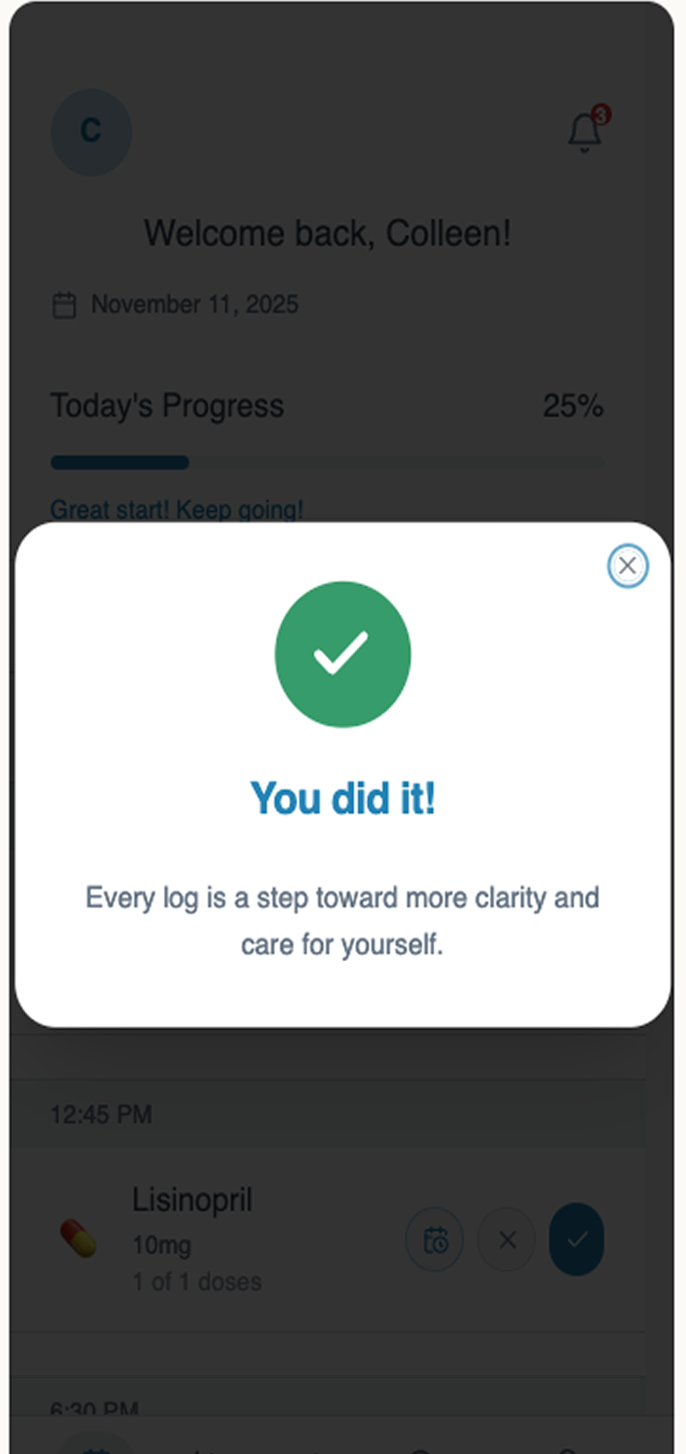
After: The experience shifted from functional flows to more intuitive, repeatable interactions with less cognitive burden.
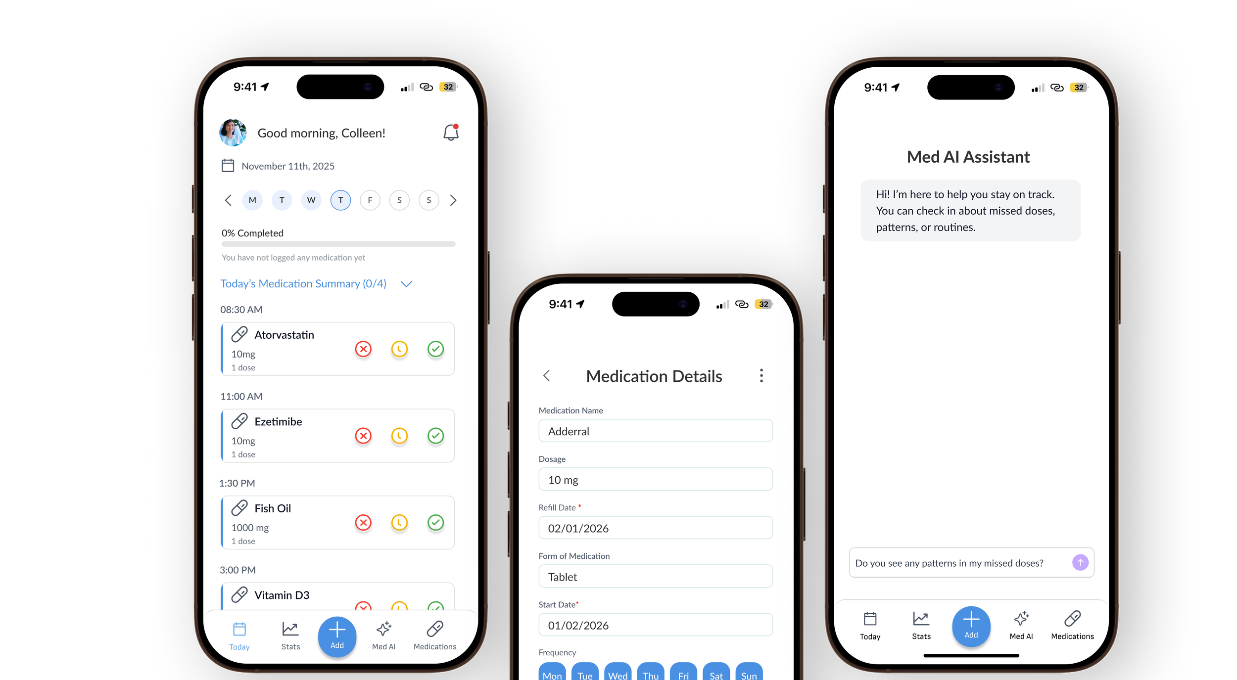
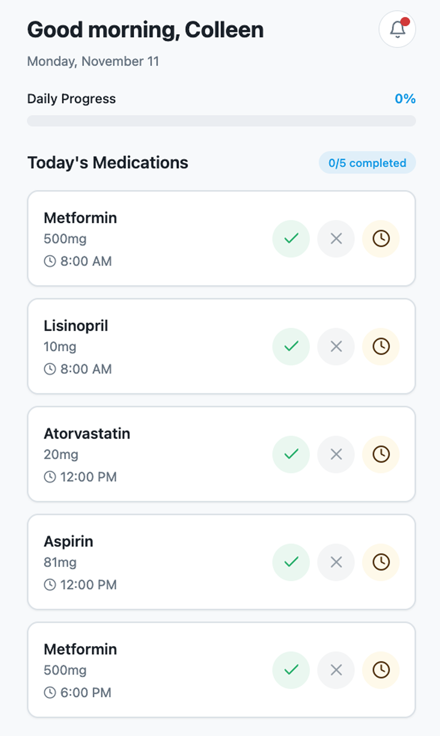
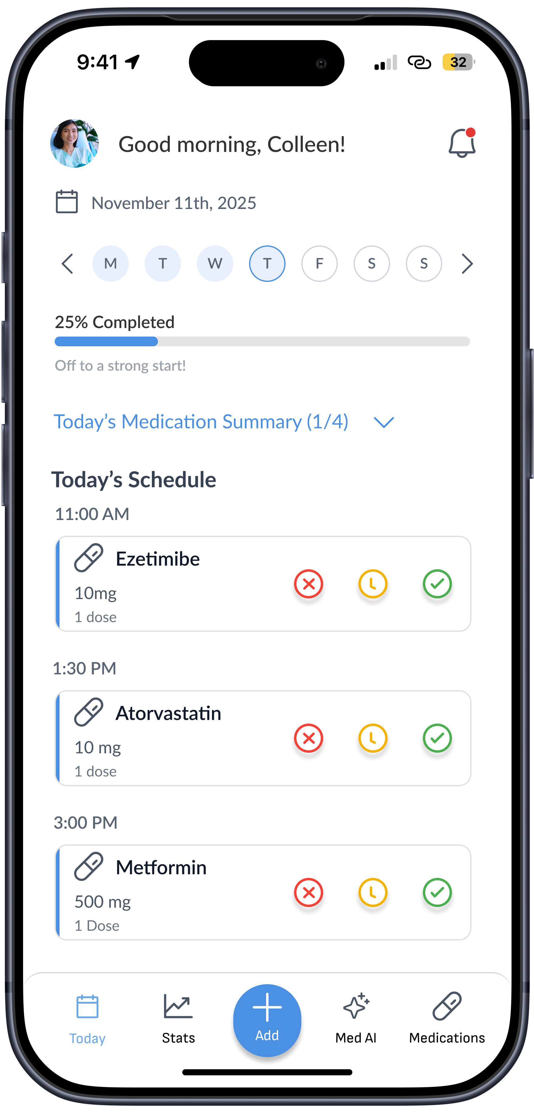
Strengthened dashboard visual hierarchy by elevating primary actions and re
Dashboard updates strengthened visual hierarchy by elevating primary actions (add / take / skip / reschedule), reducing tappable ambiguity, and improving scannability.
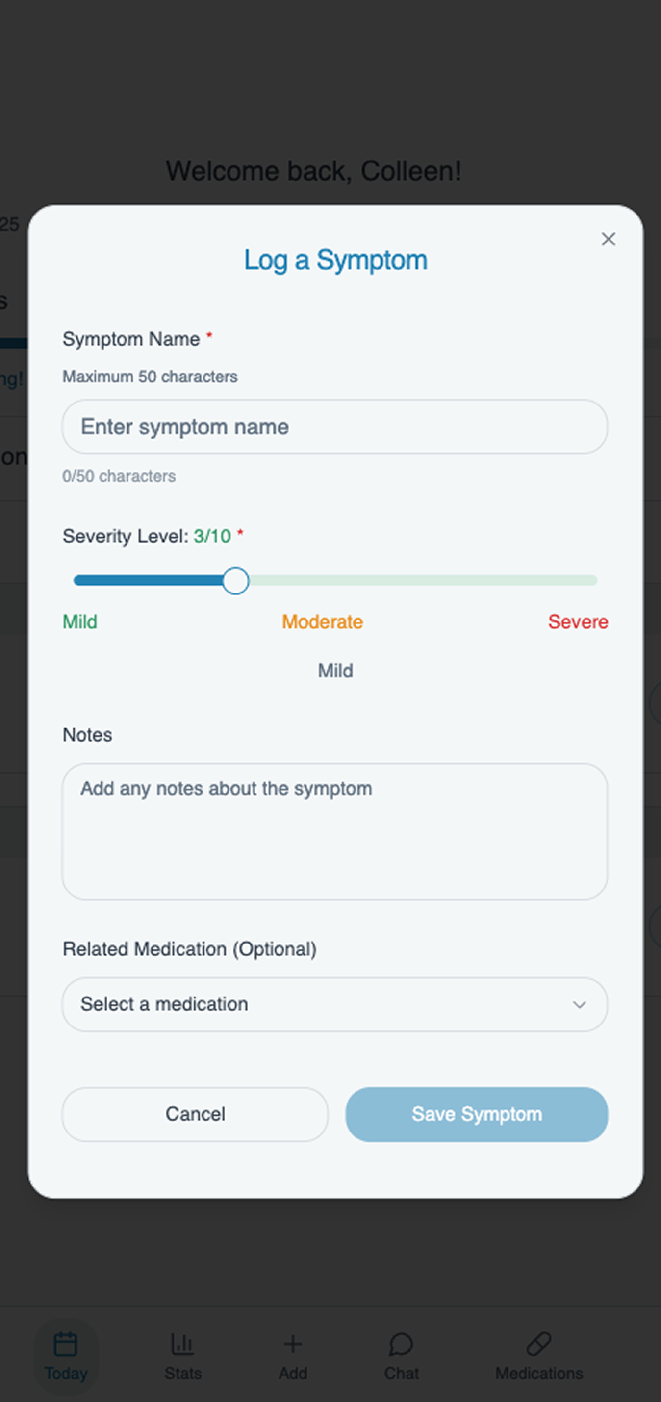
Transformed symptom and mood logging into a more guided experience that reduced decision fatigue and supported faster, more confident check-ins.
OUTCOMES & NEXT STEPS