
Simplifying Virtual Navigation Through UX Research & Design: From Overwhelming to Seamless Movement
Project Summary: Led UX Research and Design work to launch a new feature called Quick Moves
Role: UX Designer & UX Researcher
Responsibilities: Qualitative Research, Experience Design, Prototype & usability testing, Engineering Documentation
Timeline and Team: 12 weeks start to finish with 4 person, fully remote team across multiple countries
Key Outcomes: Within a week of launch, users shared that they could navigate to their desired space in just two clicks, making the experience feel faster and easier

COMPANY OVERVIEWKick Back Space is a virtual meeting space that uses spatial audio and immersive design to encourage meaningful participation and real-time interaction
Kickback Space targets facilitators, educators, and remote-first teams seeking deeper connection with participants—beyond standard video conferencing.

Enables Facilitators to quickly respond to participants’ needs

Enables natural, in-person-like interactions through proximity-based movement & conversation

Helps sessions feel more connected and “human” through natural interaction
PROJECT SUMMARYWhile users responded positively to increased engagement in the space, conversations revealed ongoing frustration with 3D navigation.
Customer feedback revealed three key navigation issues:

Unrestricted movement (i.e., walking through the space) left users feeling overwhelmed

Most preferred reaching destinations in 1–2 clicks instead of walking

The 3D layout felt intimidating and lacked clear, user-friendly guidance
To address user frustration with slow, overwhelming movement, Kick Back Space needed to design a faster, more intuitive way to navigate the space
RESEARCH: EMPATHIZEConducted user shadowing, qualitative research, and Competitor and Comparator (C+C) Analysis to understand why users felt overwhelmed in 3D environments and explore ways to simplify our navigation experience
User Shadowing Kickback’s Target users
4 Facilitators using Kickback Space regularly
Sample questions:
How would you describe your experience navigating the space so far?
What do you feel is the best way to navigate the space, and why?
What do you feel is the best way to navigate the space, and why?
4 Users new to Kickback Space
Sample questions:
How does the way you navigate affect your experience as a participant?
How does navigation impact your experience as a participant?
What comes to mind when you’re deciding where to go next in the space?
KATMAI, WELO, HORIZON WORLDS & VIDEO GAMES
Sample questions:
How complex navigation is displayed to users
Types of guidance users are given to navigate complex layouts
Assess intuitiveness of spaces
Competitor & Comparator Analysis

Call of Duty. Here, I learned how users would navigate to different parts of the space from an alternate perspective.

Katmai Tech. The remote (circled) was the clearest way to navigate amid unclear icons
“[Kickback Space] looks really cool, but without a familiar way of navigating, it feels like stepping into a 3D game where I don’t know what to do”
Quote from a user during shadowing RESEARCH: DEFINESince we already had two defined personas, I focused on how we could help each one achieve their goals
Our Personas were a Facilitator (Alex) and a Participant (Meagan)

Alex

Meagan
RESEARCH SYNTHESISResearch synthesis and user flows uncovered navigation friction. These insights shaped key design decisions—and helped us turn Quick Moves into a strategic advantage
Tailoring navigation models to our two existing personas (Facilitator & Participants) helps ensure each can effectively achieve their goals within the space

Flexible & intuitive navigation was key to helping users feel more at ease in the space.

Using familiar navigation models would help users navigate more efficiently and maximize their time.

Accounting for multiple decision points highlighted the need for more intentional navigation support.

EXPERIENCE DESIGN: IDEATE The lack of faster navigation in competitor products positioned Quick Moves as both a competitive advantage and a key driver in shifting our design direction
Quick and Efficient Decision Making
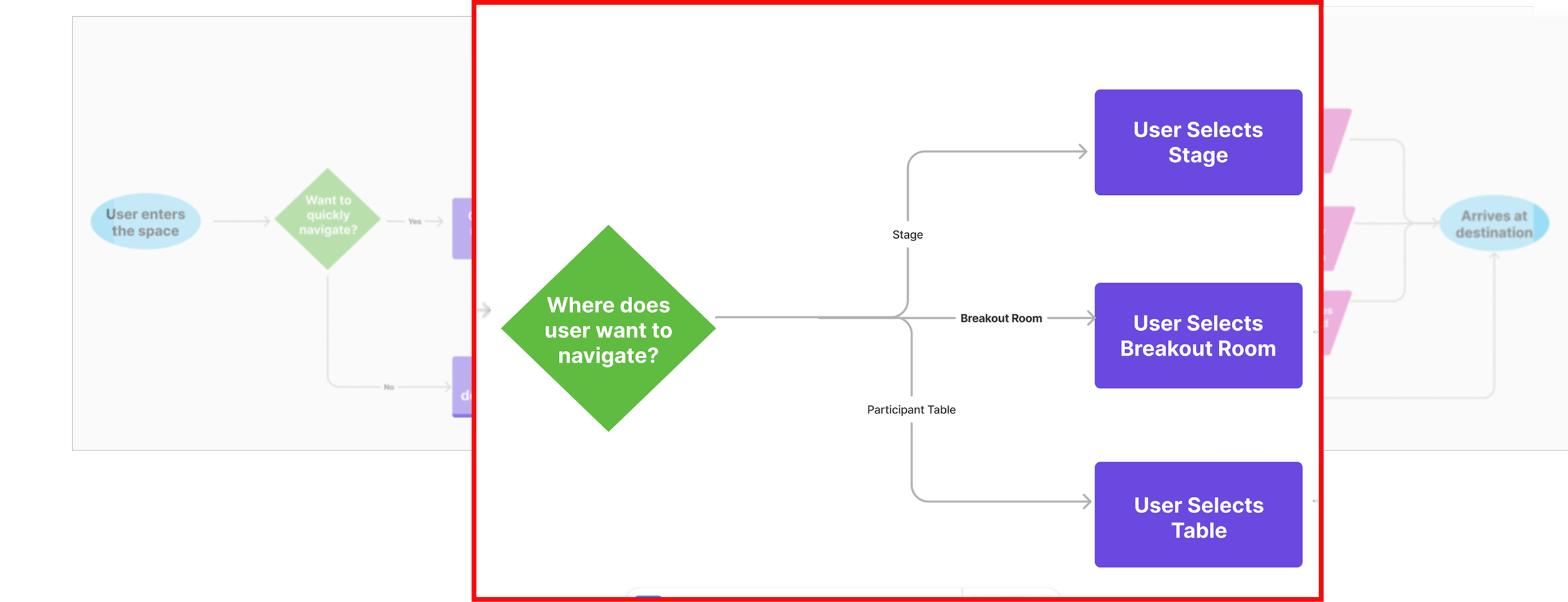
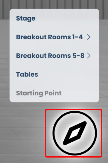
Destinations were grouped into 3 sections to improve clarity, reduce choice overload, and enable faster decision making.
To keep navigation focused and manageable, breakout room and table selection was broken into smaller steps, making decisions easier to process.
Reducing Cognitive Overload

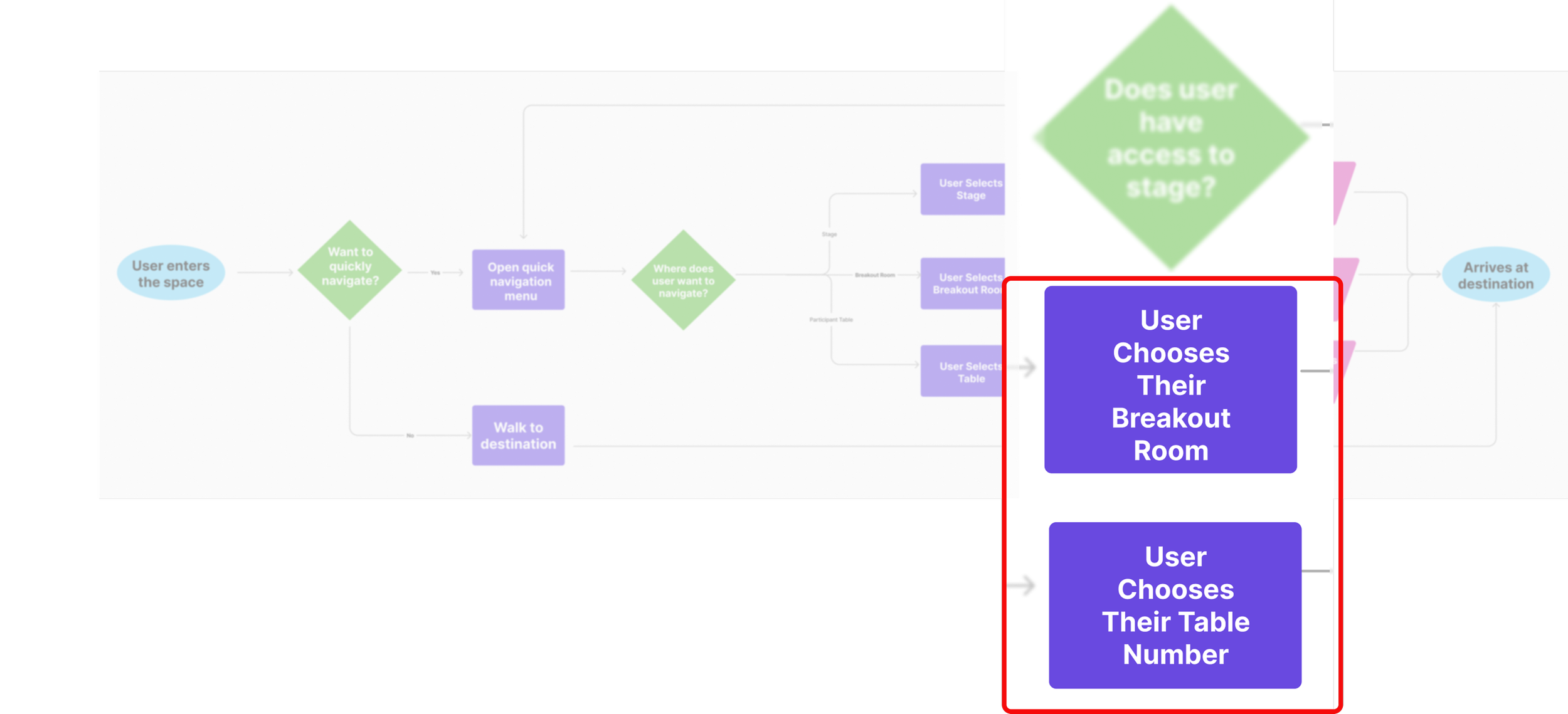
Core flows remained consistent across personas, with adaptations to support the facilitator’s role. A lightweight check preserved consistency while accounting for role-based access differences.
Consistency across roles
MID-FIDELITY PROTOTYPE, TEST, & ITERATERefined early concepts into a mid-fidelity prototype in Figma for a moderated usability testing
Why moderated testing?
Chose moderated testing to observe real-time reactions and gather immediate feedback
Asked follow-up questions during sessions to clarify user intent
Aimed to gain deeper insight into user behavior and usability patterns and evaluate task completion
Tested with users of varying tech savviness to uncover a broader range of usability issues
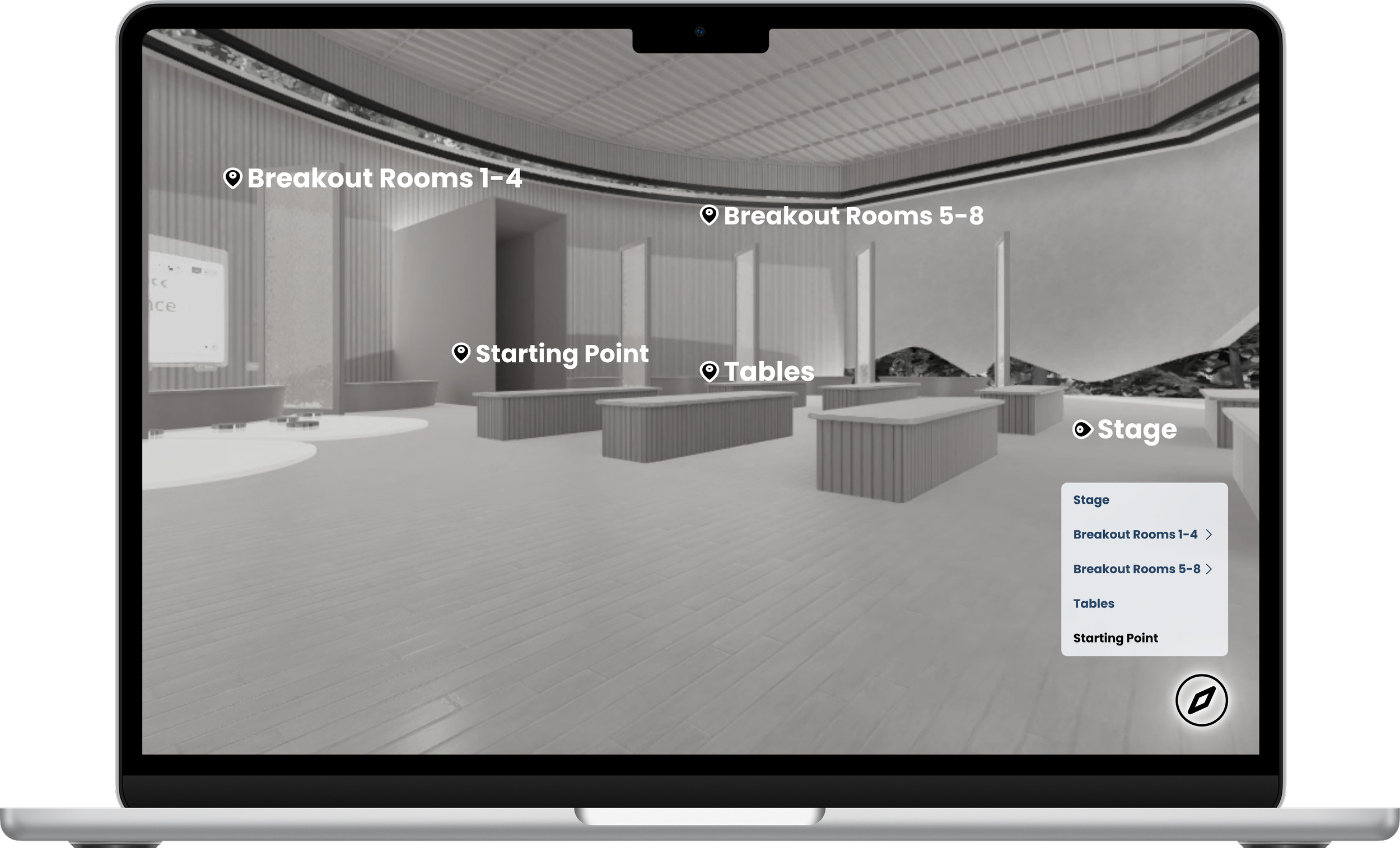
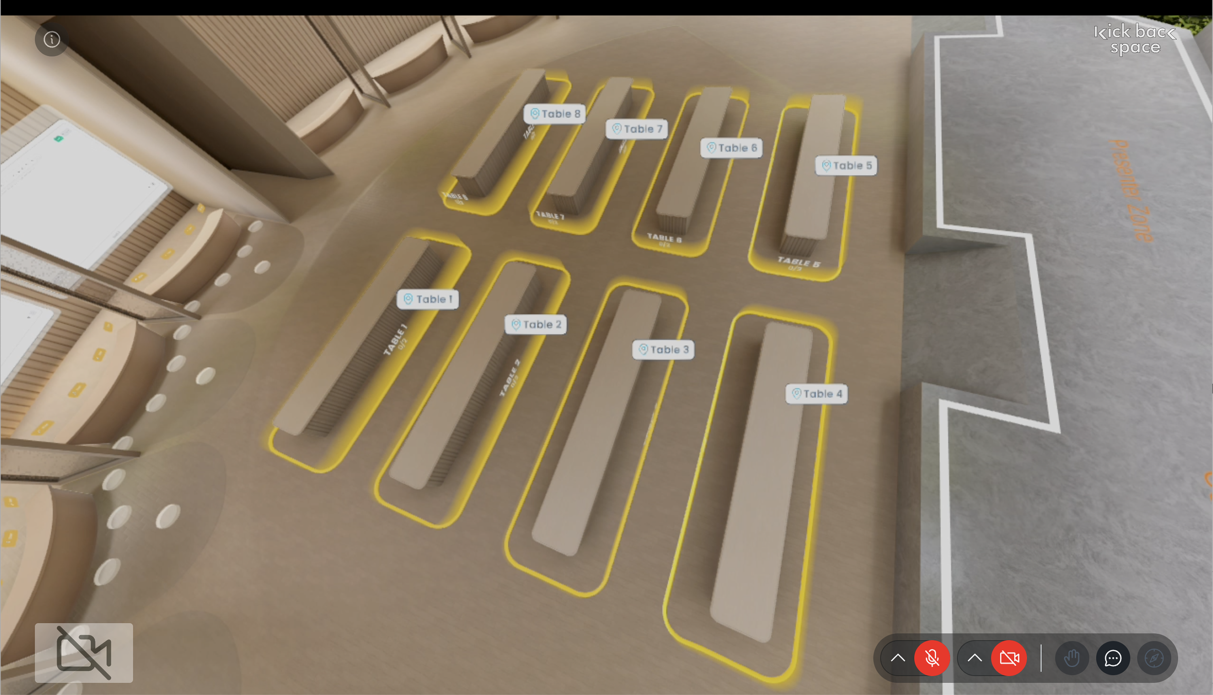
Sample of space during user testing
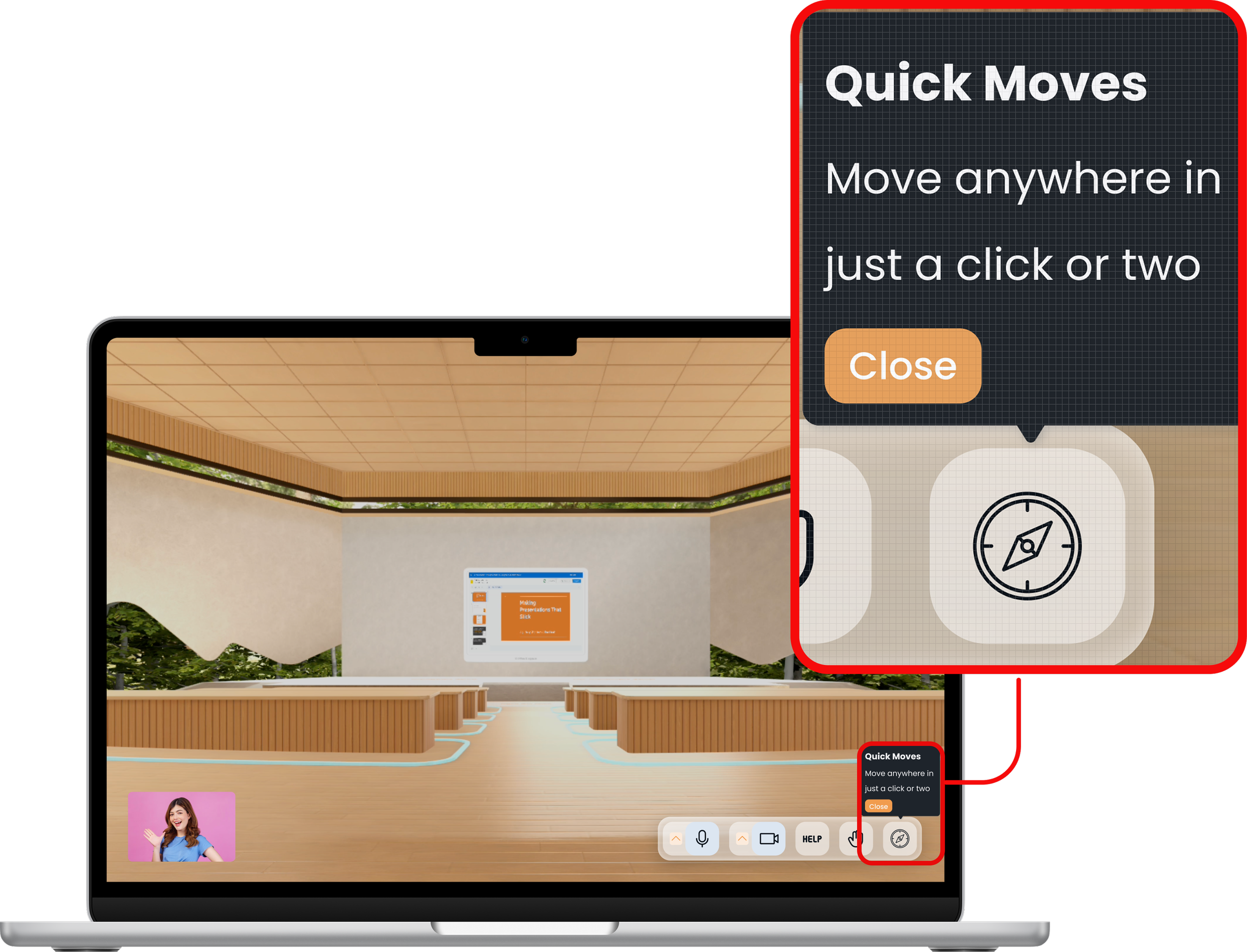
MID-FIDELITY PROTOTYPE, TEST, & ITERATEWithout tooltips or familiar iconography, users were unsure where to start—delaying discovery and use of Quick Moves
What we learned from user testing - iconography and tooltips
During testing, users hesitated to interact with Quick Moves due to unfamiliar iconography and because there was no clear explanation of their purpose
The absence of tooltips left users guessing what the feature did, leading to delays in discovery
Once users explored it, they found the feature helpful—but the learning curve created initial friction that impacted overall navigation confidence
Unclear icon delayed feature discovery.
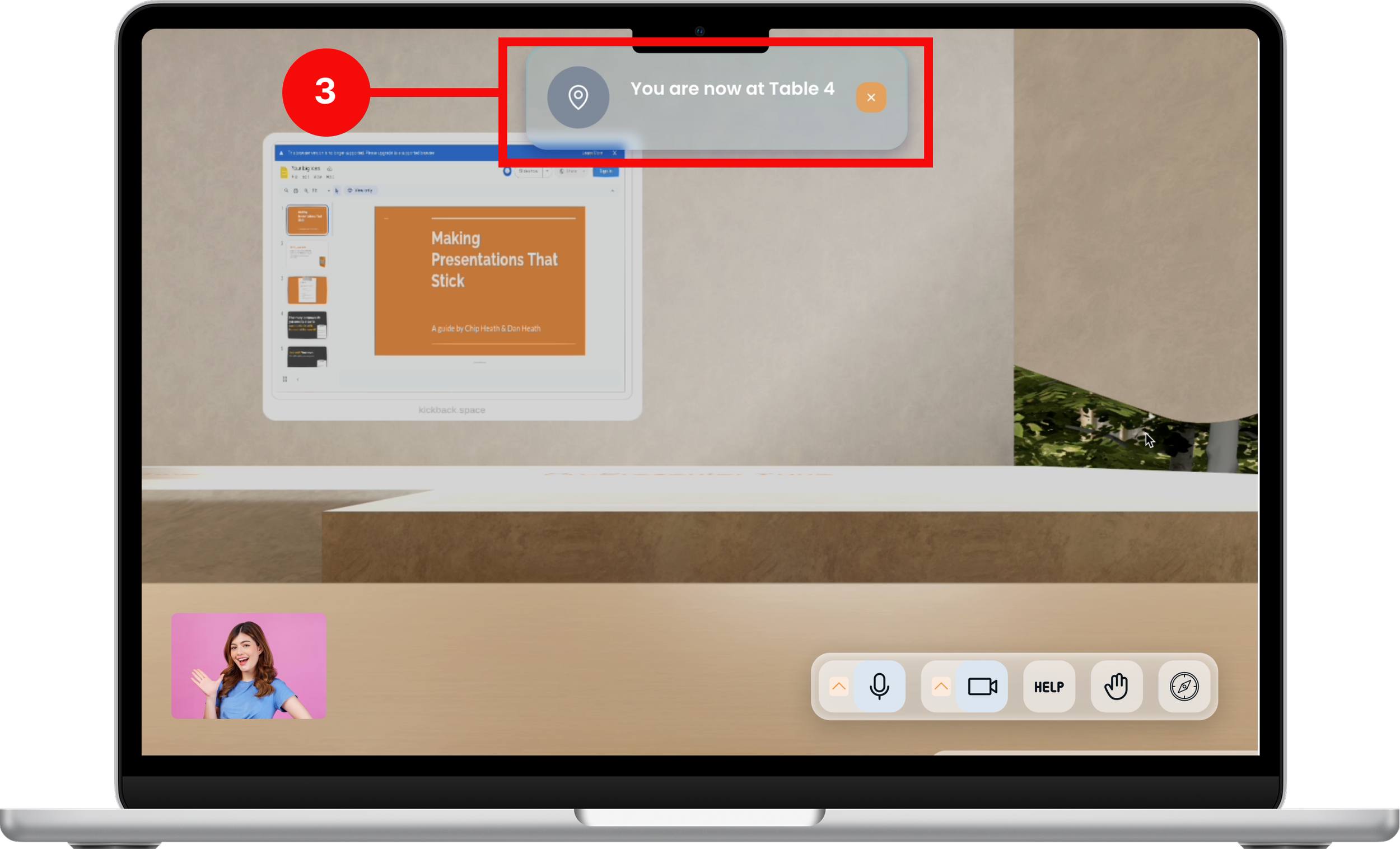
MID-FIDELITY PROTOTYPE, TEST, & ITERATEOnce users discovered Quick Moves, the lack of confirmations left them unsure if their actions were successful
After selecting a destination with Quick Moves, users often paused or repeated actions, unsure if their selection had registered.
The absence of system feedback or confirmation pop up message led users to uncertainty during navigation
Understanding the Need for Confirmation
I didn’t know what that was initially, but after a few attempts, I realized it was a way for me to navigate quickly. But because I didn’t see any kind of confirmation message, I wasn’t 100% sure if I navigated to the correct place.
- Usability testing participant (Facilitator)
MID-FIDELITY PROTOTYPE, TEST, & ITERATEBy the second round of testing, clearer cues turned hesitation into confident, efficient navigation.
UI tweaks—like an improved Quick Moves icon and added tooltips—helped users recognize the feature faster and understand its purpose, especially for those new to the platform.

User were able to navigate to their destinations within the space in just 2 clicks, instead of wandering.


Broke down the decision of choosing breakout rooms and tables into smaller steps to make choices easier to process.

COLLABORATION
When Unity couldn’t scale unique elements of designs, we pivoted to consistent patterns without losing clarity.
Despite involving engineering’s input early, the design was met with technical constraints
I originally proposed unique animations and interactions, but after engineers flagged scalability issues, I pivoted to a technically simplified solution that preserved the core navigation experience.
Partnered with engineers early to ensure designs aligned with technical constraints of Unity, however, the engineering team flagged issues with scalability and performance-ultimately leading to a different design.
Design after the scalability issues were addressed
OUTCOME
After launch, customers shared that Quick Moves made navigation easier and the space more approachable—boosting engagement and helping set us apart in a competitive space. Quick Moves made navigation easier and boosted engagement

Increased Productivity: With more intuitive navigation, users could focus on their tasks without the distraction of complex movement mechanics, leading to a more productive experience within the space.
Improved user confidence: Users, especially those less tech-savvy, felt like the seamless navigation reduced anxiety about getting lost or quickly getting to their destination when running late
Offered flexible navigation: Users appreciated now having options to choose between Quick Moves or walking through the space at their own pace.
Introduced more efficient navigation: Users were able to reach destinations in just 2 clicks, compared to multiple clicks and 30–45 seconds before.
Contributed to platform growth: Quick Moves helped reduce friction and stood out as a differentiator within the virtual communication space
LESSONS & REFLECTION
Even sleek designs fall short without intuitive navigation when users, especially those who aren’t tech-savvy, struggled to move through 3D spaces confidently.
What I learned:

Aesthetics v. Usability: A visually appealing design doesn't guarantee a seamless user experience. It's crucial to balance aesthetics with functionality to meet user needs effectively.

Importance of clear visual cues: Users initially struggled to identify the navigation icon, highlighting the need for intuitive and recognizable interface elements to guide user actions.

Inclusive Design is Essential: Designing with all user skill levels in mind ensures that both tech-savvy and less experienced users can navigate and utilize the space confidently.