
Earth’s Delight

Website redesign of a well-known plant store.
For the sake of privacy, I am not going to be sharing the plant store’s actual name and instead will be using “Earth’s Delight”.
Problem:
Despite having a great reputation in their area, the website was not user friendly due to it's lack of proper information architecture. The lack of a solid informational architecture impacted overall satisfaction of the shopping experience and learnability of the website.
Project Overview
Solution:
Through user research, I wanted to create a website that had proper information architecture so users can have a positive shopping experience. Being a plant person myself, I know that plants are complicated to raise depending on how much knowledge an owner has, so I wanted to craft an experience that catered to users at any stage of their plant journey, whether they’re beginners or experts.
My role:
Timeline:
Tools:
Sole UX Researcher, UX Designer, & UI Designer
2 weeks
Figma, Zoom, Google Docs
User & Product Research
Competitive Analysis
For competitors, I looked at The Sill, Bloomscape, and Lively Root to understand how current plant stores cater to different types of plant owners and how they displayed complex plant information to users.
What did I learn from a competitor analysis:
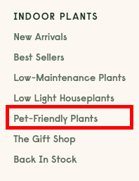
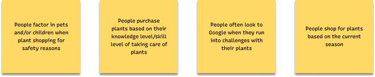
1. Online plant stores don’t organize just based on types of plants, but based on things like buyer living situations, gifts for events, knowledge level of plant buyers, etc.
2. Products are organize based on safety concerns
3. There is a spatial element with where products are placed
Affinity Mapping from User Interviews

Heuristic Analysis on current website
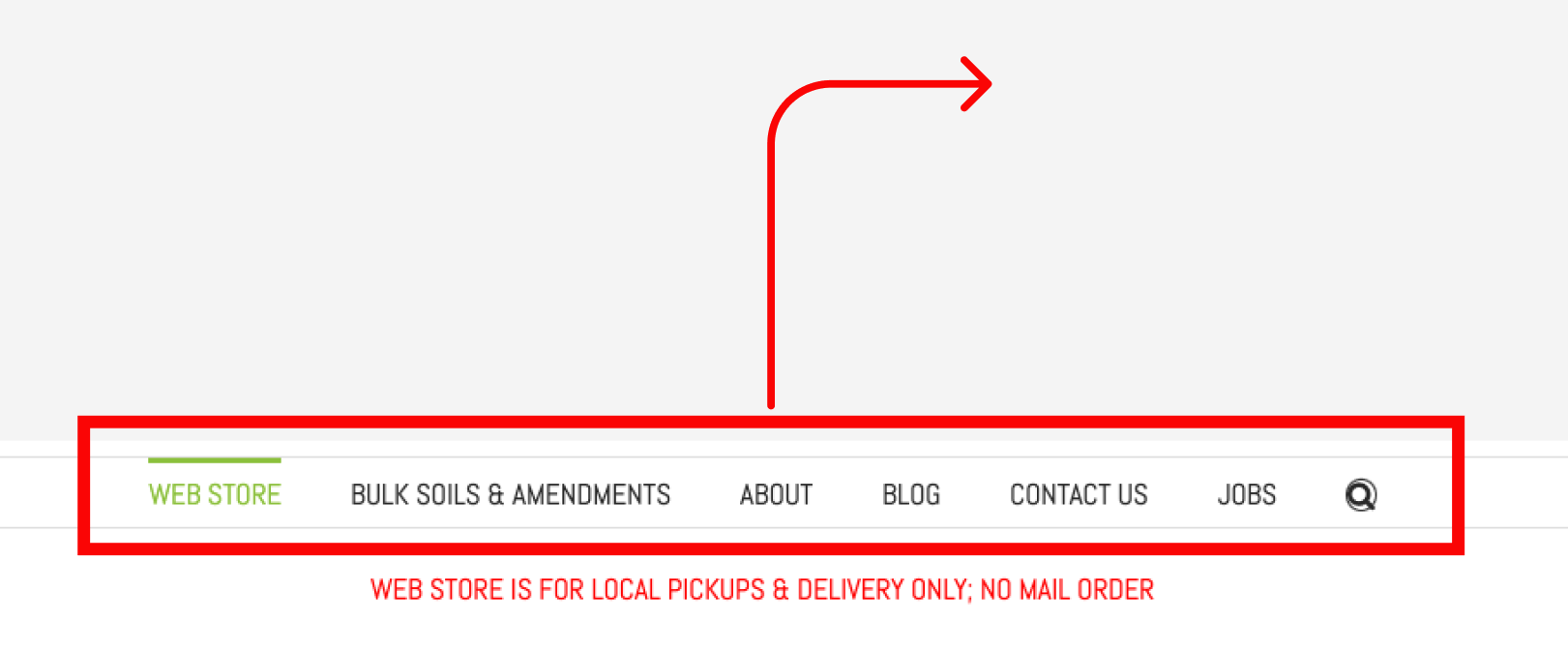
It was probably one of the longer heuristic analyses I have performed on a website. Here are a couple of examples of how a user might find this experience less than ideal shopping at this online plant store.
The goal of the research was to understand more about the behaviors and personality of a plant enthusiasts, the challenges and enjoyment of plant ownership, how users shop for plants, and what the expectations are for an online shopping experience.
This violates the heuristic of consistency and standards, as the website navigation is extremely confusing and deviates from common navigation design patterns.

Based on safety concerns, like pets

How products were grouped based on the season and living area.

This violates the heuristic of aesthetic and minimalist design, as the information architecture is poorly structured, with product options laid out randomly and not in set categories. The entire page is extremely cluttered.
User Testing
What did I learn from testing?
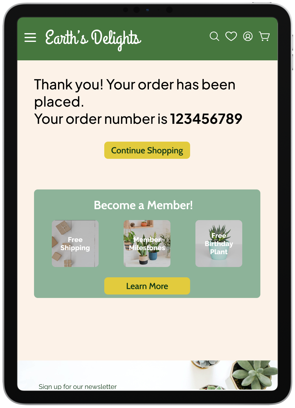
Users didn’t feel like they were building a “reputation” with the website. They wanted to see shipping details and/or reviews on the landing page. Only then will they proceed more confidently with their shopping experience.
Categories needed to be more clear yet, have less options so users were not too overwhelmed with options.
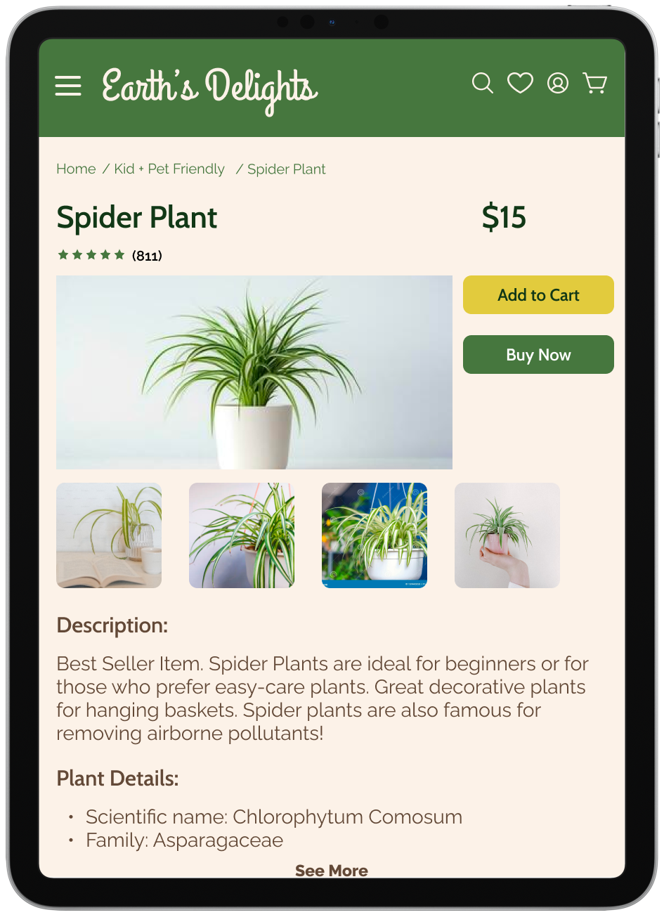
Overall, users felt the product page included enough information users needed to confidently purchase a plant.
I conducted a moderated user testing on 10 users who ranged from novice to expert “plant parents”. The goal of the testing was to see if I redesigned a website that made the online plant shopping experience efficient, yet give users the amount of information needed to purchase a plant confidently.
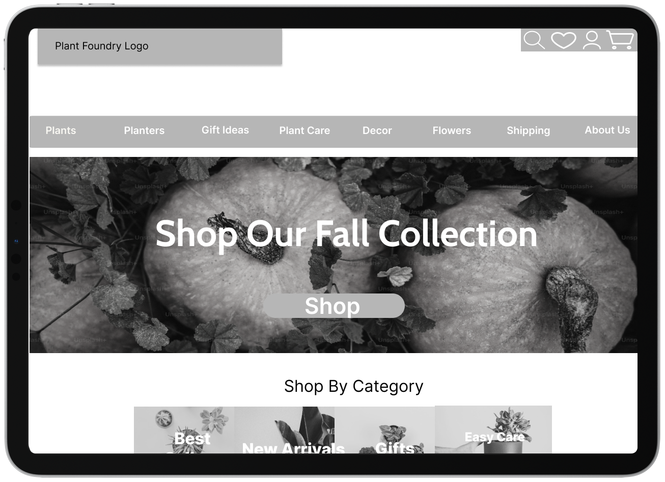
Final Designs

To explore more of the design, go here.
My designs were intentionally exploratory, focusing on visual concepts and ideas. While not every element is fully clickable, the goal of my prototypes was to effectively illustrate the key interactions and flows that I learned from user testing.
I included the home page, product page and checkout process in my final designs. Since I have never designed on tablet devices, I saw this as an opportunity to design the hi-fidelity in a tablet.